
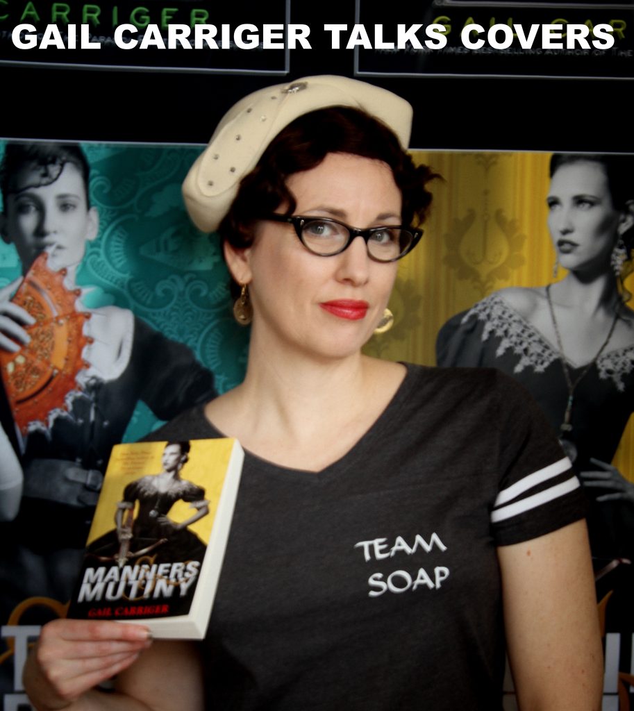
Hello, Gentle Reader, I’m always thinking and talking a lot about cover art. I love it and it fascinates me. I’m pretty sure I have a career because of the cover of Soulless.
How to make sure the cover is not just good but the right on for you book.
Why some covers really do not work.
Picking the right cover art:
Covers are like a visual elevator pitch for a book, they don’t need to say exactly what’s in it so much as what’s it’s about. They are the label on the shampoo bottle.
My new saying? The pretty is the enemy of the correct.
The point of the cover is not to find AN audience for that book but to find the RIGHT audience.
I think a lot of indie authors forget this, and get embroiled in trying to make it look too much like what’s inside and not enough like packaging that represents the book’s theme.
That last statement may have made some of you angry, because it smacks of manipulation.
But stick with me, okay?
Goodreads put up a ton of books on sale and I went to check them out.
Three interesting things happened.
- I wasn’t interested in a single one of them. (I’d either read it already, or it’s not to my current taste.)
- The range of art as meets genre was fascinating, and many of the covers did catch my eye.
- I really wanted to blog about it.
Let’s play a game of is that a good cover?
Looking at these covers lets see what genre they make us think of, whether we would buy it or not, and why.
Here are 10 covers that stood out for me:
Without knowing anything else but having only those small images.
And without reading anything about the books.
I’m gonna tell you what I thought when I saw its thumbnail.
Let’s see if you agree with me?
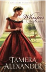
Whisper
What I like: Clear indication of romance given the swirly font and large female author name. Horses indicate old west or plantation setting. Red and cream is a tasteful coloring.
Issues: Can’t read whole title. Cover is generic.
What do I think this book is about? Heterosexual romance in a historical setting. Demure pose and the fact that she is alone in the picture with a horse in the background suggests sweet romance (little sex).
Was I right given the blurb? Yes
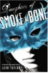
Smoke & Bone
What I like: The color pallet, the starkness of the lighting, the slash nature of the mask and the title.
Issues: Didn’t realize the title was Daughter of Smoke & Bone until I really squinted, can’t read author name at all. Not sure how I feel about three different fonts on the same cover.
What do I think the book is about? I’m going with suspense of some kind, in the Gone Girl oeuvre maybe? Because of the mask, perhaps it’s either historical or set in a theater, makes me think Phantom of the Opera.
Was I right given the blurb? Sort of. Suspense but also urban fantasy?
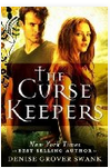
The Curse Keepers
What I like: KILLER title! The shadow box to make the title pop while still over the figures is a neat trick. I like centered text.
Issues: Author name is not legible, bit generic, weird tattoo stuff on left necessary?
What do I think this book is about? Without a doubt this is in the Cassandra Clare, Beautiful Creatures, etc. YA angst show knock off. This one will be witches and warlocks and stuff like that, no vampires (because of the sunlight and lack of blood red color).
Was I right given the blurb? Yes.
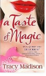
A Taste of Magic
What I like: Very easy to read title and author name, bold color choices.
Issues: Not a lot, actually, while this might not be my kind of book, I think it reads as a near perfect cover for the kind of book it is. Let’s see if I’m right.
What do I think this book is about? Romance, chick lit version of Practical Magic. Contemporary set urban fantasy but with a very light touch and gentle upbeat text, probably involves food. Beach read.
Was I right given the blurb? Yes.
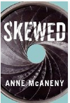
Skewed
What I like: Fantastically striking cover, retro feel, very basic but impactful, color choices. Title and author are clear and easy to read.
Issues: Absolutely no idea what it is about. Could be anything from a quirky adult version of Awkward (that MTV show) or a non-fiction tell all about the music/photo/modeling industry.
What do I think this book is about? Really, no clue. If I HAD to guess I’m going with quirky mock-tell-all of a photojournalist’s crazy hi-jinx. Possibly set in the 1960s.
Was I right given the blurb? Turns out it is about photography, but also celebrity, and crime in a modern setting.
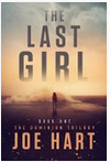
The Last Girl
What I like: As with the romance one above, I think I know exactly what I am in for with this book. Title and author name are clearly visible.
Issues: I really strain to see the figure, I wish it were just big enough for me to make out something about her clothes as that would give me a bit more to go on for setting.
What do I think this book is about? Gone Girl type thing again, maybe post apocalyptic, but could also be country western setting.
Was I right given the blurb? Not really. Turns out to be an epidemic crisis book. Looks like that movie Children of Men.
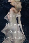
Under Different Stars
What I like: Striking image for the main photo, stark and atmospheric feel. This gives a slightly uncomfortable and weird feeling.
Issues: The title and author name are kinda hard to make out.
What do I think this book is about? Lit fic, just because of the contrast between the watery image but “Stars” in the title. I’m very wary because it could be a “Cancer Mom” type story. Read: depressing as hell.
Was I right given the blurb? Not at all. Turns out to be a sci fi YA romance. So I would call this one of the cases where the cover is striking, but doing the book no favors.
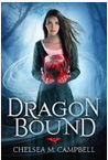
Dragon Bound
What I like: Again this is one of those that tells me exactly what I’m in for. I like a cover that uses blues and pinks for contrast, and I tend to gravitate towards centered lettering.
Issues: No idea what she is holding, hard to make out author name. Quite generic.
What do I think this book is about? Straight up no frills female main character urban fantasy. Probably heterosexual and featuring dragons as the hook. Modern setting.
Was I right given the blurb? Not really. It’s fantasy not UF, and historical-ish. (I did wonder since she’s in a dress and not leather pants, but the white t-shirt underneath threw me off).
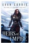
Heirs of Empire
What I like: Strong female central figure, power pose, can read both title and author name. Interesting choice on both serif and sans serif fonts.
Issues: Generic title, cover comes off as old fashioned. Makes me think author and text may be old guard and out of touch. Male author with female protagonist is a red flag for me, personally.
What do I think this book is about? At first I thought epic fantasy because of her armor and the title and serif font, but then I noticed the spaceship in the background and the author name is sans serif, so I’m going with space opera.
Was I right given the blurb? You know what, I still don’t know if this is fantasy or space opera. I think maybe something like Dune? But the blurb doesn’t make anything clearer.
Added later for the sake of interest:
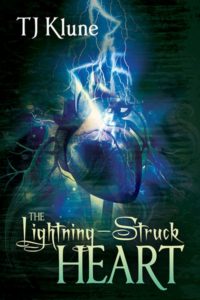
The Lightning Struck Heart
What I like: I like the color choices and the central image, the legibility of title and author name despite font choices.
Issues: I find the horizontal gradation on the background distracting, it makes me think this is a small image that has been manipulated larger but wasn’t high rez enough; Looks like an old TV.
What do I think this book is about? Future, urban fantasy or superhero, or maybe something epidemic or zombie like The Strain. Definitely dark.
Was I right given the blurb? Not even slightly.
- I chose to add this book specifically because I resisted buying it for years, despite recommendations from practically everyone. Why did I resist? THAT COVER. I don’t like super dark stuff.
- Turns out, this is the opposite of dark.
- Turns out this book is a super funny comedy about a gay wizard and his BBF the swishy hornless and horny unicorn, Gary. It’s so flipping funny I cried laughing.
- Does this cover indicate this key selling point? No.
- Does this cover indicate fantasy? No.
- I’m calling this one of the worst covers in a long time. It’s fine, just NOT FOR THIS BOOK.
Here’s a sample of the range of my cover art as of 2021
8 posts about cover art!
- Cover Art & Its Purpose in Life
- Divinity 36 What does the cover art remind you of?
- The Range of Cover Art – Soulless
- The Range of Cover Art – Blameless
- The Range of Cover Art – Heartless
- Gail Reveals Secrets About Cover Art, Book Titles, & The Omega Objection (Video Q&A)
- The Story Behind the Cover Art & Title of Poison or Protect
- Heroine’s Journey Cover Art
More Good Articles on Cover Art?
- A Quick Look at the Fine Art of Book Spine Design
- You CAN Judge a Book by Its Cover from Fiction University
- Making Your Self-Published Book Look Good, Part Four: Building the Cover
- Here’s a good article on How To Brief A Cover Designer.
- 7 Tried & True Ways to Make a Book Cover Decision.
- A great article about cover art design and why pick one over another.
- Many Authors Don’t Have Control Over Covers; Here’s Why
I also have a lot to say on the subject when connected to using a pen name because yes YOUR NAME IS PART OF YOUR COVER (why did I choose a new pen name?).
I talk in depth about how I chose my cover art for my indie books in this YouTube video: what I look for how I choose images and type set and colors.
Find my books
Directly from Me | Amazon | Kobo | Apple | Bookshop.org | Barnes & Noble | Chapters – !ndigo | Foyles
- Did you miss my latest release announcement? Want more sneak peeks, free goodies, gossip, behind the scenes info? This stuff goes to my Chirrup members, because I love them bestest. Sign up here.
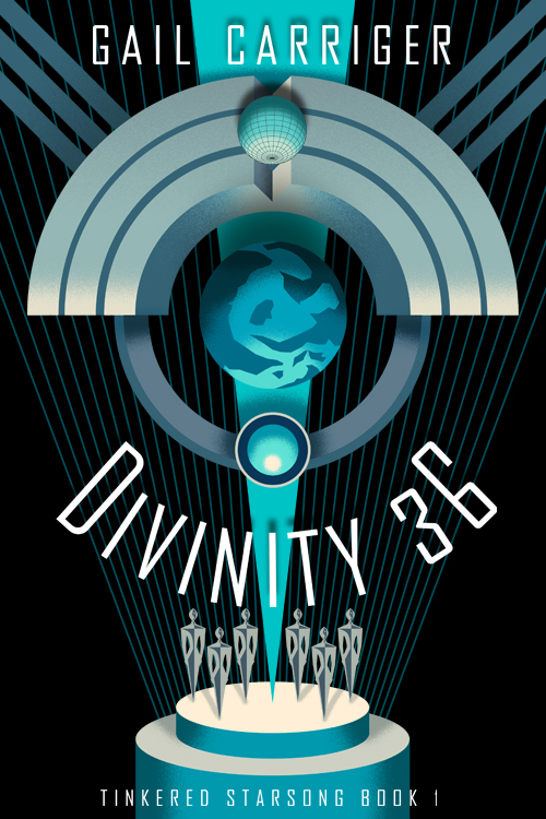
My current favorite cover?
Divinity 36: Tinkered Starsong Book 1
PICK YOUR VENDOR!
Direct from Gail
The aliens are coming for us and they want our voices.
New York Times bestselling author Gail Carriger brings you a gloriously warm and unique scifi about the power of art, celebrity, and found family.
GAIL’S DAILY DOSE
Your Writerly Tinctures . . .
Book News:
Quote of the Day:
“A bookstore is a good place to go to be brave.”
~ Kate DiCamillo
Tags: Beginning Writers, Cover
I was surprised by the photo for Imitation. It looks like an even-whiter version of the controversial original cover for Justine Larbalestier’s “Liar”. Obviously not every reader will recognize it and remember that mess, but I found it off-putting. Which is too bad, because the book sounds interesting.
That is the exact same photo with color correction. So, that’s fun? Probably a stock image.
The only one of these I’ve read is Daughter of Smoke and Bone, and it was fabulous. Way up on my list of favorites. The second and third volumes weren’t quite as good, and I didn’t read the fourth, but definitely read the first. It’s about a tough martial artist girl out of Prague who goes around collecting the payment for magic her guardian (father?) made. The payment is the teeth of wild animals. Full of great magic and strange, interesting creatures.
This was fascinating! I wonder to what extent our interpretations of covers are influenced by what we ourselves read, as sometimes when you, Miss Gail, guessed urban fantasy, I guessed historical fantasy. For example, when I saw Dragon Bound, I immediately thought, “Hmm, historical fantasy but with THOSE types of inaccuracies like young women complaining about how their corsets hurt their bodies all the time and socials gaffes that no one actually brought up in the era would ever make.”
I’ll definitely share this with my friends, probably the second-nerdiest thing I’ve done today.
Ironically enough, the generic title may have been why I pick Heirs of Empire. My mind went Heirs of Empire->Heir of Empire by David Weber->I LOVE DAVID WEBER!->What’s the back cover blurb say? Even more ironically, Heir of Empire isn’t part of one of my favorite series of his (those would be Honor Harrington and Bahzell Bahnakson)
I had a good laugh at the blurb on “Daughter of Smoke & Bone”:
“When one of the strangers–beautiful, haunted Akiva–fixes his fire-colored eyes on her in an alley in Marrakesh, the result is blood and starlight, secrets unveiled, and a star-crossed love whose roots drink deep of a violent past.”
Star-Crossed Love as a result of intense eye-contact with a stranger with weird-colored eyes? That REALLY reminded me of this gem of a twitter account (@broodingYAhero), and makes the book sound utterly generic.
I have noticed the YA covers that feature the Ethereal gauzy female figure tend to indicate a weak female lead with lots of Twilightesque gender nonsense, and are exclusively hetero. (Which is really weird considering Greek mythology) The bottom one is reminiscent of Uglies. These styles tend towards strong female character who end up in in an anti establishment conflict.
I think there is a cover algorithm in use somewhere.