Here’s how an illustrated cover can come into existence…
For my new short story featuring Alessandro Tarabotti, Gentle Reader, I decided one of the things I really wanted to do was commission a professional artist. This was the end result…
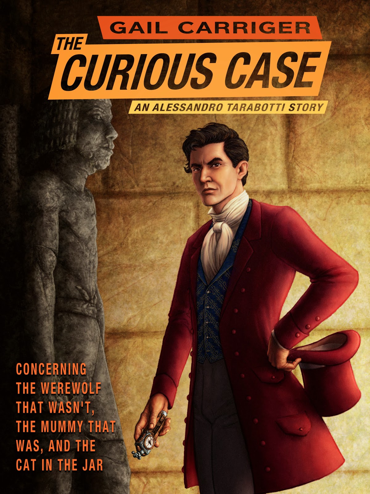 |
| The Curious Case of the Werewolf That Wasn’t, the Mummy That Was, and the Cat in the Jar By Gail Carriger |
How did it happen?
I started by pinging a number of author friends of mine for professional artist recommendations. I wanted someone who did good work in a timely manner and had ebook experience. I also asked for ball park cost figures, so I had some idea of budget. (I do not expect a short story to recoup paying professional artist rates, this was about the experience.)
However, before reaching out to any of the recommendations provided, I remembered Pete.
Pete Venters had shown me the most amazing sketch of Cherie Priest’s main character, Briar from Boneshaker, partnered with Alexia when we were all at a steampunk event together. I knew his reputation as an amazing artist, particularly for Magic the Gathering. This influenced me, since I’ve had a tough time dealing with amateur artists in the past. I wanted a professional who could make deadlines and would not be insulted by criticism if I wanted alterations to the sketch. I pinged him to see if he might be interested, and he was!
Then, while on book tour, I met up with Pete for dinner and we chatted briefly about the project. After a number of email exchanges we hammered out a contract, payment, and expectations on both sides.
The Process
First, Pete read the story.
Then, over email exchanged, I described what I envisioned: the figure, Alessandro’s looks, and various different background options. We talked back and forth about what would work best. It’s important with ebooks to have something relatively clear and easy to read in thumbnail size for mobile devices and grey-scale for eReaders.
We addressed Alessandro himself. Pete did research into the clothing for men at the time period. I sent him various images. We discussed actors/personalities who I imagined looked like Alessandro.
 |
| copyright Pete Venters |
Pete sent me the above faces sketch and we hashed out which expression I liked and how this effect his seeming age and mood. I wanted Alessandro annoyed, but not angry, and looking relatively young.
 |
| copyright Pete Venters |
Then Pete sent me a sketch of him in his outfit and background. We decided on inside the tomb as a good way to show he was in Egypt, but not be too busy, and not give plot away. We discussed how the sand would look and the Ka statue in the background. I think Pete learned more about Middle Kingdom Egyptian rock cut tombs than he strictly wanted. We started to talk about the appearance of the steampunk device in Alessandro’s hand.
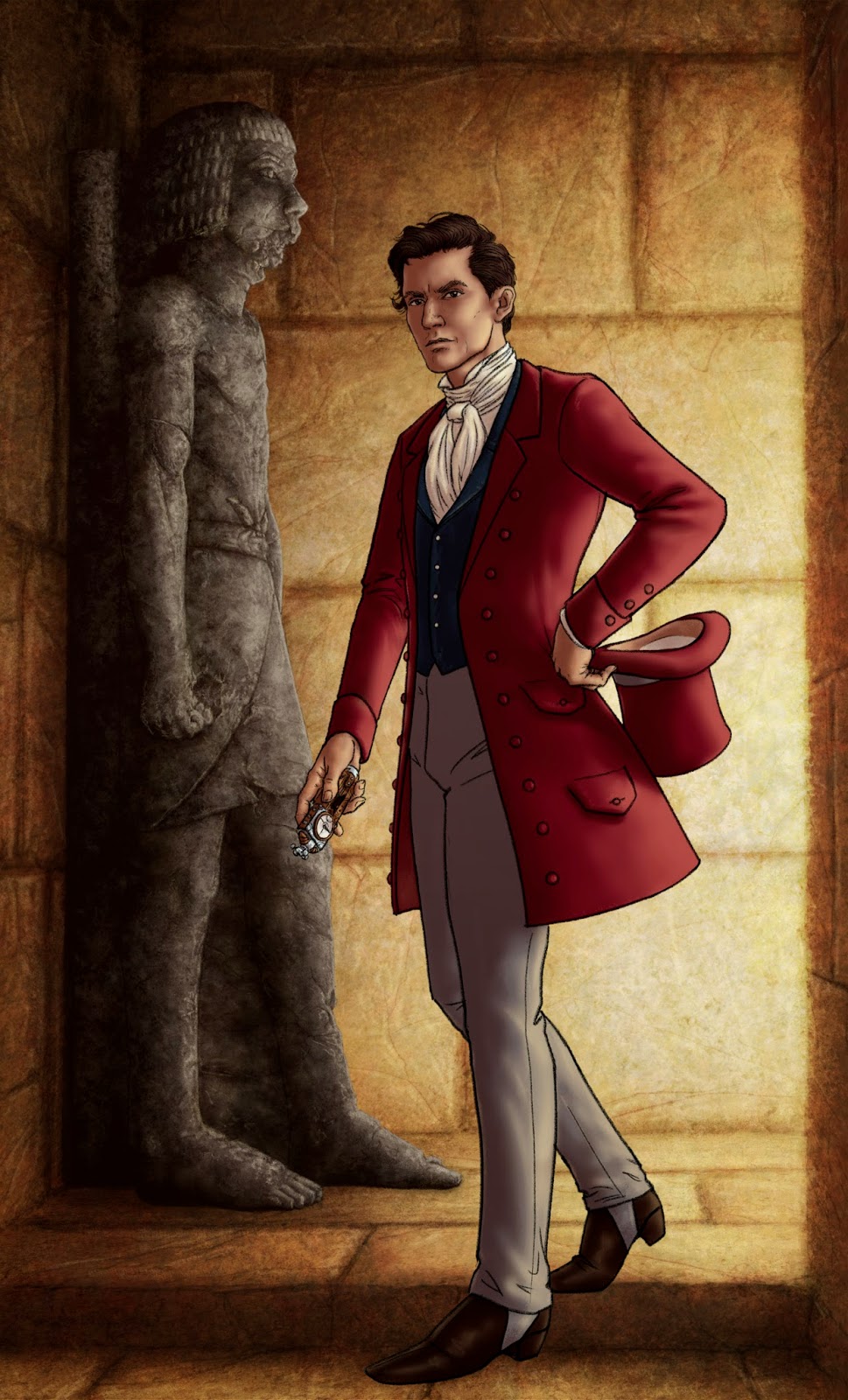 |
| copyright Pete Venters |
Next Pete sent me the beginnings of color. I had earlier suggested the Ka statue could be less pristine but I reacted negatively to the decay on the statue, I felt it looked like a zombie. We agreed that the shadow on Alessandro’s face made him look old. Also, there was some question of the hat. Did I make the grave mistake of having him leave it behind in the text? Oh no! Alessandro would never abandon his hat. So I had to fix a bit of the story itself.
Pete was like, “You can do that?”
I was like, “The glory of self publishing, if she wants to, the author can accommodate the cover art.”
Besides I often do that anyway, if I can. The mention in Changeless where Ivy straightens Alexia’s hair on board the dirigible to Scotland? That’s because Donna’s hair is straight on the cover, but Alexia has curly hair in the text so I wrote a new scene to compensate.
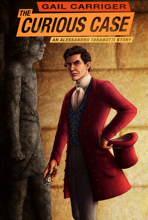 |
| copyright Pete Venters |
In the next version of the cover, Pete zoomed in on the figure. As you can see the background statue is fixed to be less a zombie, and Alessandro’s face is brighter lit and appears younger. Also texture has been added to his waistcoat. The title is put in, which gave us some concern, as it’s so long. In the end, we put half the title at the top and the rest as the tag line.

Although it was not part of our contract, Pete kindly did the titles for me. This was awfully nice of him. However, you should know that if you intent to higher a professional artist for the cover art (and not for the finished cover itself) that artist is only responsible for the image, not the title text.
Because this is a Parasol Protectorate in world short story, Pete kept the title as similar as possible in style and font to those used by Orbit on the Parasol Protectorate and Custard Protocol books. He zoomed in a little more for clarity and also to mirror the aspect proportions on my book covers (AKA how much space on the cover the figure takes up with respect to background).
There you have it, mostly the basics. There were a lot more tiny details (like pixel proportions of a retina-screen iPad) but I don’t think you would find them all that interesting.
I enjoyed the experience of working directly with a professional immensely. And I highly recommend Pete’s work and attitude.
Pete is talking about this too: The Curious Case Covered
GAIL’S DAILY DOSE
Your Writerly Tinctures . . .
Book News:
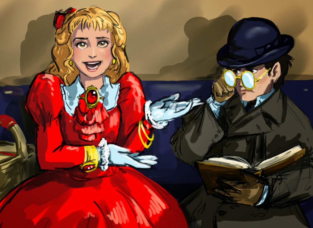 |
| dimity_and_pillover___finishing_school_1_by_poisonmilow |
I would like a print.
I would really love a print but I'm an international reader. Would it still be possible?
I think you might like to see this.
http://geyserofawesome.com/post/91054411982/this-adorable-little-hedgehog-was-made-using
It's a little hedgehog made by using a recipe from 1817. There is also a link in that there speculate that the recipe might actually be a reprint of the one from 1747 source. Could be a good thing for your research 😉
Would love to purchase two prints!
I don't know, it will be up to Pete to decide but I will let him know of your interest.
Thnak you! I really love the cover and can't wait to find out more about Alessandro Tarabotti
I have been put of touch am catching up on my blog rollCount me in if he decides to offer prints.
Grrr. I don't think my broken iPad got that quite right. I have no idea what I just posted but I would love to buy a print.
Thank you for putting this short story on Kobo. I now have it as an e-book. Can barely wait to start reading it !
This comment has been removed by the author.
Since I don't publish on Kobo, this very much worries me. Could have come from a pirate, could have come via a Smashwords push over. I'll now have to waste half a day looking into this. Sigh. Self publishing, we hates is precious. We hates it.
Turns out, all is well. It's a push over from Smashwords.