
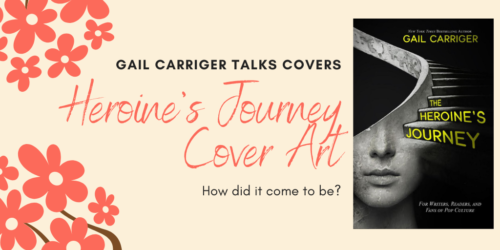
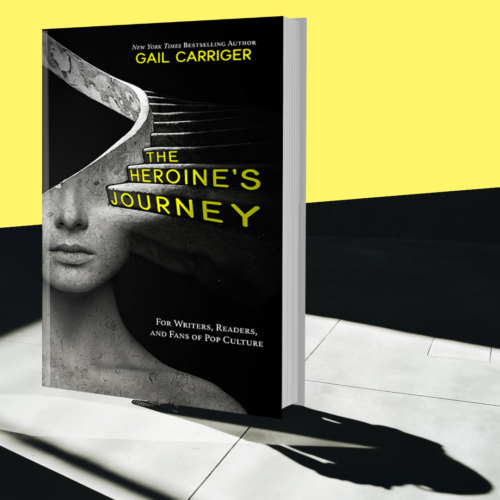
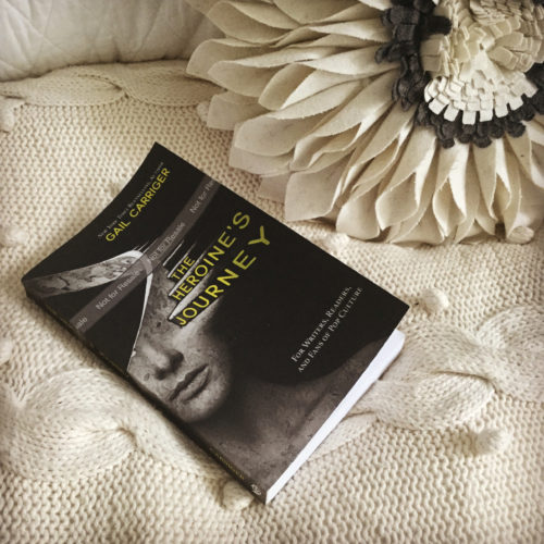
A little while ago I released the Heroine’s Journey: For Writers, Readers, and Fans of Pop Culture.
Shall we talk about the cover? This time… nonfiction?
The thing about covers is they need to do a ton of work for a book.
A fiction cover needs to signal genre, tone, voice, and author brand, as well as be appealing to the right reader. I talk a lot about fiction covers here.
Nonfiction covers need to do something different. They need to indicate what question they are answering, mood, style of approach, and subject matter.
Despite the fact that Starla doesn’t normally do nonfiction, she agreed to work with me on this one, partly for the challenge of it.
Prior to reaching out to her I did a TON of research looking at comparative titles and trends in non-fiction in all the nonfiction categories I though this book would satisfy. Here’s a sample of three of those categories:
Okay, while I was doing that I also looked at price points and color profiles and other exciting things (spreadsheet time!)
Starla and I came up with two possible images for the covers and put those to a private vote on various different private online forums, this one was by far the winner:
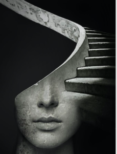
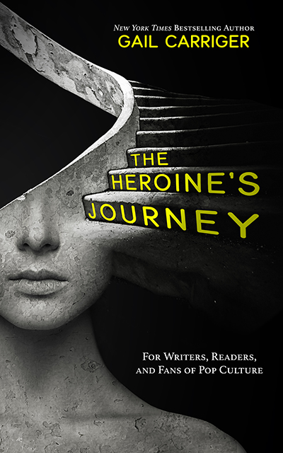
The Image
I wanted an image that was evocative of both ancient, feminine, and journey. I’ve been collecting inspirational images on Pinterest for a while now. (Starla and I usually start of with a shared private Pinterest board.)
We started with a path instead of stairs, but that looked a bit too snake-like (and I don’t talk about Medusa in this book) so we went to a spiral staircase instead.
I’m generally a big fan of the spiral stair. I had one in my old office, and I always take pictures of them when I encounter them in the wild.
Starla applied and ancient stone treatment to the stair and the face.
In the final cover, I had the image shifted up and around in order to accommodate and centralize the title treatment and to show the neck and collar bone – as an indication of openness.
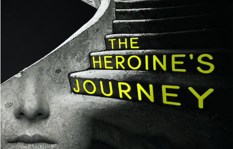
The Title Treatment
I chose a sans serif soft rounded font for the title.
- San serif because this is nonfiction and for visual clarity when in thumbnail view.
- Rounded for the circularity of the journey.
Also this kind of font and treatment is common in older pop culture posters and comic books. I wanted to indicate the pop-y nature of my discussions, subject matter, as well as the lightness of tone in the writing style. (Read: NOT academic or dry.)
The Color
The yellow color was the most contentious part of this cover.
Some of my dearest friends strongly objected to the yellow. Frankly, I don’t consider myself a yellow person either.
However, it was the best option by far. Why?
- Yellow on black is very popular in How To books and writing guides.
- I liked the cheerfulness of yellow juxtaposed against the moodiness of the image.
- Orange looked too Halloween.
- Red on black is hard on the eyes, and kinda “bloody.”
- Pink made this look too much like women’s fiction.
- Green is uncommon in any of the non-fiction topics/subjects/categories I wanted to hit.
- Blue made this look too much like a memoir.
- Purple almost won, but again it’s really uncommon in nonfiction of the type, and it didn’t carry the happy/upbeat aspect I wanted.
So there it is, that’s how we ended up with this cover. Lots of other things were considered like how it looks in black and white. Also the spacing of the fonts on the cover, the font of the sub-headers, and the placement of all the different elements on the page.
Starla was very patient with me it took about 3x longer than normal.
Luckily, I love this kinda thing and I think we ended up with a pretty fantastic cover.
8 posts about cover art!
- Cover Art & Its Purpose in Life
- Divinity 36 What does the cover art remind you of?
- The Range of Cover Art – Soulless
- The Range of Cover Art – Blameless
- The Range of Cover Art – Heartless
- Gail Reveals Secrets About Cover Art, Book Titles, & The Omega Objection (Video Q&A)
- The Story Behind the Cover Art & Title of Poison or Protect
- Heroine’s Journey Cover Art
Yours,
Miss Gail
- Did you miss the release announcement and exclusive pre-order deal for this book? This kind of thing goes to my Chirrup members, because I love them bestest. Sign up here.
BOOK DE JOUR!
The Enforcer Enigma, third the in San Andreas Shifters series.

PICK YOUR VENDOR!
Direct from me?
A werewolf without rank or hope and an enforcer who has lived too long go up against the selkie mob.
Gail’s Daily Tea Party
Book Nibble
15 Paranormal Mystery Books To Read Right Now – Soulless on this list
Writer’ Tip
An A to Z Guide to Literary Devices and Tools
Quote to Sip
“Without libraries what have we? We have no past and no future.”
~ Ray Bradbury
Tags: Cover, HEROINE'S JOURNEY