
For anyone wanting to sample the first chapter of this second book in the series, Demigod 12, I decided (because this is a trilogy) not to post that publicly.
Too many spoilers.
If you preorder the book directly from me you get the whole first chapter right now.
And it’s a special Chirrup this month (July 2023), so you can read it that way too.
Meanwhile, shall we talk about Demigod 12‘s cover art!?
Releases August 1, 2023!
Preorder digital on most vendors
or directly from me (comes with perks*)
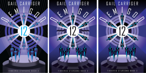
About Demigod 12‘s Cover!
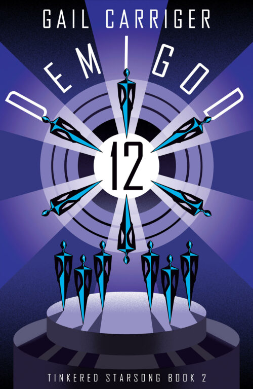
Isn’t it spectacular?
The cover artist is, once again, Paul Sizer and he is so much fun to work with.
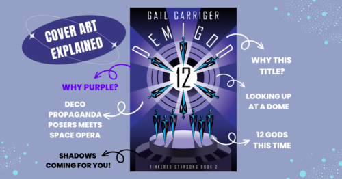
As with the previous book I went with a deco propaganda feel.
Why deco?
- It’s cool looking and still a touch historical (which works for me because that’s what I started out writing).
- 1930s is also the time period that saw the rise of the sci-fi pulps and I want to nod at that history of this genre.
- My grandfather was a big sci fi reader and I remember his early two-tone cloth-bound books from the 1920s & 1930s (likes Verne and Wells) hanging around. So for me this style is very nostalgic to my introduction to the genre.
- But mostly? It’s hella cool looking.
Why propaganda?
The aliens want you!
Why this title?
That’s made pretty clear through the course of this book, but all the books in this series have “D” titles with numbers following. Why?
- I like shorter titles that marry well.
- I like alliteration.
- I like the look of numbers (rather than the words).
- I think a number carries a more sci-fi feel – i.e. “12” instead of “twelve.”
Thoughts on 2nd covers in series:
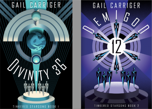
The second cover does a lot of work for its series.
- It has to marry or match really well to the first one.
- It needs to pop without clashing.
- It needs to clearly carry on any elements of series aesthetic set up by the first cover.
- It needs to be unique in its own right and, of course, represent the story within.
(This last I am not going to talk about, because spoilers, but after you have read this book I suggest reexamining the cover for all the clues Paul and I stuck in there… nudge nudge wink wink.)
In the case of a trilogy, the second cover also has to bridge the first book and the final book in an aesthetic way, but still stand out on its own to carry readers through any possible slump.
Demigod 12‘s inception journey…
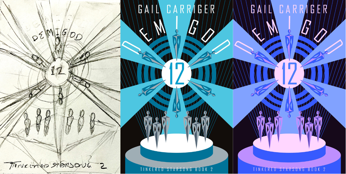
L-R: Demigod 12 original sketch. First image based on that sketch + Divinity 36 cover. Gail’s color response filter
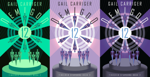
L-R: Gail testing out acid green. Cover designer’s 2 responses to Gail’s requirement for LIGHTER shades & purple please
The final tweaking, and end result.
In general, in my life as an indie author, there’s a lot of me reminding designers of 3 things with my book covers:
- That this is not actually a poster or art piece so please pull back on details. IMHO in this modern age a book cover has to look clean and nice in both thumbnail and greyscale digitally as well as wrapped around the printed pages.
- Please BRIGHTEN it up. Most artists work on large very bright and intense monitors and don’t realize how crap the rest of us are both on desktop, mobile, and e-reading device. They often think in terms of the physical product first, digital second, when I prefer to approach the other way around. They also often lean aesthetically kind of dark and gritty as humans (artists = goths and such). All this means that for me and my stuff? They tend to lean too dark. (Also FYI printing presses tend to print darker.) So I’m constantly being like “pick it up,” no, seriously, “lay off the black.”
- That the title and author name are super important visual elements (especially for an established author), and need to pop. Typology and font are vital in book covers and often neglected by author-publishers in particular.
Why Purple?
So I didn’t have a specific color profile in mind for this book. (I did for book 1 & book 3.) We went with the purple because, as you will soon see, it is the perfect bridging color between this book and the third. Also, notice this cover is just that much lighter over all than the first one?
That’s intentional.
I actually considered an acid green because of the alien nature of green as a color. But it was just a little too creepy for me and for this book.
The figures…
In book 2 we’ve moved closer in on the gods and their stage. The dome is looming over us now. The shadows of the performers are stretching forward, encroaching on the audience (and reader) in a hungry way.
There are 12 gods depicted in this cover because the book features two pantheons (of 6 each) on tour together. But those two pantheons are at different places in their careers, different levels of celebrity and fame, hence the positioning.

Secret extra bits…
One of the things readers (and authors, to be frank) don’t understand about the second book is that most of the work that the cover is doing is actually going to sell the first book.
Existing readers who already enjoyed book one will probably pick up book two unless the cover is truly terrible. But new readers will be attracted by the new book cover, only to realize it is the second in a series and then actually go get the first book instead.
I hope you enjoy this cover and this little journey behind the scenes, and I can’t wait for you to read it.
I do so love Phex and all the aliens he is collecting around himself, and I really hope you to too!
DVD Extras!
- All about Divinity 36’s cover art
- Read Divinity 36 the whole first chapter of Divinity 36
- 10 Best Bits of Divinity 36 Research
- Pronunciation Guide for the Tinkered Starsong Books + Alien Linguistics (no, literally)
Yours (currently upending my closet looking for purple clothes),
Miss Gail
Find my books
Direct | Amazon | Kobo | Bookshop.org | B&N | Apple | Foyles | Mcnally Robinson | Angus Robertson
Here’s a printable Downloadable Checklist of ALL my books!
- Did you miss my latest release? Want more sneak peeks, free goodies, gossip, behind the scenes info? This goes to my Chirrup members, because I love them bestest. Sign up here:
BOOK DE JOUR!
Divinity 36: Tinkered Starsong Book 1

PICK YOUR VENDOR!
Direct from Gail
The aliens are coming for us and they want our voices.
New York Times bestselling author Gail Carriger brings you a gloriously warm and unique scifi about the power of art, celebrity, and found family.
Gail’s Daily Tea Party
Tisane of Nifty

My current obsession is my favorite milk oolong tea (Taiwan) colored with butterfly pea flowers (Thailand) so it matches my book cover (the far future) because I am bonkers.
Writerly Tincture

Gail Carriger & Piper J Drake on book tour in Seattle at Barnes & Noble Northgate
Book Nibble
Quote to Sip

Huge fan of all your stories. Can’t wait for more. Your Hug-able aliens are adorable. At least they are in my mind.
Thank you so much, Sarah!
Thank you for all the details about this particular cover (& book covers in general)! It makes me truly miss & feel nostalgic for when I worked at bookstores (Borders RIP, Barnes & Noble for a bit after, & a summer at the campus book store at the uni where I went for school).
Aw, yay, I’m glad you enjoyed it. I love thinking and talking about cover art.