Hello Gentle Reader,
Today I have for you the story behind the cover of Poison or Protect! And now more on the cover art of my first self-published novella…
This is the first in the Delightfully Deadly series which are grown-up spin offs from my YA Finishing School series.
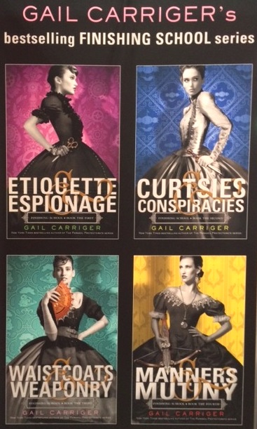
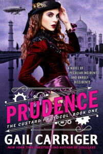
Hopefully you can see the tonal familiarities?
Elements I specifically targeted and married over:
- font style and upright title treatment (it’s not angled or slashed)
- model stance and gaze (specifically from the Waistcoats cover)
- wallpaper and shading
- characters in black & white (I shifted to sepia tones)
- the main color being the background
- one additional pop of contrasting color (in my YA this is the weapon, in my new series it’s the red lipstick – these books are sexier)
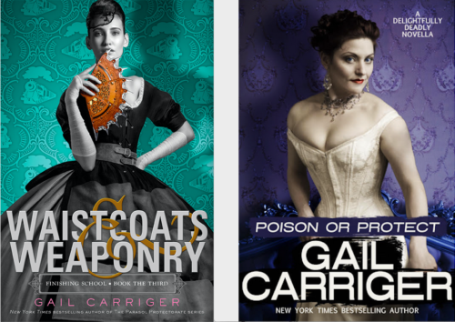
Differences?
The fact that I made my own name bigger than the title is an intentional branding and feminist choice. Branding: As an indie project I need to catch the attention of my existing reader base, which means making my name the biggest thing on the cover. Feminist: In SF/F men often get to have their author names larger than the title but women rarely do. So yeah, f-’em.
I chose an underdressed model and to emphasize the red lips because these books are sexier than their YA counterparts and I wanted to make that obvious visually. The slash behind the title is a take off from my adult Parasol Protectorate series, and is meant to signal “this is adult like those” to my existing readers.
Other intentional choices? Titles
The series title DELIGHTFULLY DEADLY was chosen because one the words reviewers and fans most use when describing my books is delightful and I thought it was such a good word I decided to thank them and have fun myself by using it for a series title. Also these two words provide a contrast that is intrinsic to my spy characters: that they can be both delightful and deadly. I made this alliterative too, in order to harken to my first series, The Parasol Protectorate. Finally they aren’t coupled together commonly so I could own the search term and the SEO.
The titles for the Delightfully Deadly series are all also alliterative, just like the original Finishing School titles, but I will use or instead of & as these stories emphasize a choice the main character must make between being an spy and being in love: Poison or Protect, Defy or Defend, etc…
Each title also indicates who the main character is:
- P = Preshea’s book = Poison or Protect
- D = Dimity’s book = Defy or Defend
And so forth. This is a mnemonic device so I can remember the titles (since I forget my own titles but not main character names), and as a little cookie for my readers.
Finding the Cover Model
I like to work with independent photographers, models, and small businesses. But I am not above using stock art. Just FYI.
I had a good idea of what Preshea looked like, and frankly, Autumn is a friend of mine and I always thought of Preshea as looking a little bit like her. Not that Autumn is cold or liable to poison you (in fact she is one of the warmest, nicest, most generous people I know), but she does have the right LOOK. Autumn and I have worked together for yers (once, long ago in a different life I actually did some modeling for her, but I digress) so I pinged about her professional images and turned up this gem.
Why did this image attract me?
I wanted something confrontational, with Preshea staring out of the cover directly at the reader. (She’s an assassin after all. It needed to feel almost aggressive.) I liked the contrast of the white dress/underthings with this pose. (This was from a wedding shoot. Dark Garden does some truly amazing bridal couture.) Also the cover MUST say romance, I can’t have readers deluded by the cover into thinking this is any other kind of story. I work very hard never to leave my readers feeling betrayed and that starts with cover art.
I feel like this image hit all the right notes. So I reached out to Autumn and she gave me the photographer’s contact info. A short while later the lovely Perry Gallagher had licensed me the image. Image in hand I went to Starla Huchton for the cover design.
How did I find Starla?
Starla is a friend of mine via the podcasting world. However, that alone would not have been enough, if the quality of her work weren’t stellar. She’s a particularly adaptable cover art designer, who can change her style drastically given the type of story. Take a look at her gallery if you don’t believe me.
So we talked fonts, putting paint slashes behind my name and title, arrangements, layout, and so forth. The idea was to draw on the slashing-behind-the-words style of The Parasol Protectorate books, but keep the coloration and lay out style of The Finishing School books. At the same time, this cover had to be different enough to show that this was a new series, adult, and romantic.
The first and second passes. You can see that after the first pass I asked to see the font as white over black, and shifted down, also I wanted to see what a more vibrant background looked like. I found that blue too vibrant. So Starla tweaked it one final time and…. MAGIC:
You can see how the purple is more vibrant but not as overwhelming as the blue? The text is balanced at the bottom, and Preshea looks out at you, calm, coy, and ever so slightly threatening.
Perfection!
Why the purple and not pink like the other first books in your series?
Well, Poison or Protect is NOT the first in a series. It’s a stand alone. I wanted to make that very clear. I felt pink might be misleading. Also Preshea is not a pink person. She is cool and calm and very icy. She wears blues, greens, greys, and whites in all her appearances in this book and I wanted to stick with that for her character.

Want more behind the scenes sneak peeks? Join the Chirrup
8 posts about cover art!
- Cover Art & Its Purpose in Life
- Divinity 36 What does the cover art remind you of?
- The Range of Cover Art – Soulless
- The Range of Cover Art – Blameless
- The Range of Cover Art – Heartless
- Gail Reveals Secrets About Cover Art, Book Titles, & The Omega Objection (Video Q&A)
- The Story Behind the Cover Art & Title of Poison or Protect
- Heroine’s Journey Cover Art
GAIL’S DAILY DOSE
Your Writerly Tinctures . . .
Harvard Loses Copyright Infringement Case Against Steve Elmo
Book News:
Gail Carriger Made the 100 Must-Read Sci-Fi Fantasy Novels By Female Authors list by BookRiot
Quote of the Day:
“Everyone’s mysterious before you know them.” “But w-when you know me, I won’t be mysterious anymore.” “Yeah, you’ll be you, and that’ll be better.”
~ Waiting for the Flood by Alexis Hall


Thank you for sharing and I can’t wait to read it. I love your world! If I could hug it, I would.
And getting to see the original photo and the first runs at a cover is so interesting!
It would utterly DELIGHTFUL if Sophronia would be in one of theses novellas – it’s such a shame that she is barely even mentioned in the Parasol novels, but I suppose that’s the mark of a good intelligencer. 😉
She is in the shadows, always.